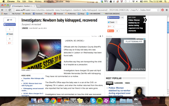
Our group analyzed the website for WYFF News, Greenville’s local news provider.
Our first impression of the website was that the advertising is very distracting. There is a logo for a company right by the logo for the station, which confused us as to what the website was actually about. There was also so much media available that the website looked extremely busy and hard to follow. The one part that we really appreciated was a Breaking News banner that covered the most recent, up-to-date stories.

The site seems credible because it appears professionally designed and maintained. They use their own individual brand at the very top and keep the articles relatively simple and minimal. Some of the stories seem frivolous and irrelevant to main issues, which questions this established credibility. Unfortunately, stories like Justin Beiber will catch the eye of readers more than real news in many cases.
In general, our group believes that the writing is objective and factually based. There are sources and quotes in almost every article. They get to the point, only giving the main information and no extra cute stuff. In some cases, this can be a negative attribute because readers don’t feel they have gotten the full story. This is also support for the fact that online journalism is more concentrated on speed and efficiency over fact checking and filtering.
We believe the authors identify with the readers through the topics, as shown above. Because the writing seems relatively objective, the authors don’t seem very human until we find stories that relate to culture and our society as a whole.
The stories are arranged for easy reading. The paragraphs are short and to the point, one idea. The headlines give exactly the information the reader needs to decide what the article is about and every author makes good use of deckheads.
WYFF doesn’t make use of many hyperlinks or subheads through out the stories. As mentioned, the paragraphs are short and to the point with some images to accompany. Most articles have a picture at the beginning with text following the rest of the way.
The rhythm of the site is consistent with a pretty standard formatting style. The site doesn’t use very many hyperlinks and if they are used, they are only internal, leading to other previous stories from the same news station.
The site is relatively creative with multimedia because it utilizes pictures, videos and slideshows. There are pictures in every article and only a select few have video. There are slideshows of various stories that rotate through to show the reader specific information about each.
WYFF packages stories through the use of these slideshows and images. The graphics on the site are extremely distracting and make the site seem cluttered. The reader doesn’t know where to focus his or her attention on the page. The ads and graphics are colorful, some make sound and some move. The graphics themselves are consistent, but they’re consistently annoying through the entirety of the website.
Each page has the ability to stand on its own because each page handles a different story. The navigation is pretty good, we thought. There are just a lot of options to search and move around through the site. We worry that there are too many options for readers and they become overwhelmed. The website does have a bar at the top that designates various general topics to help readers find exactly what they’re looking for though. The website has options available to share and comment on their material, but not many people have utilized it.
Overall, we found the general user experience pretty low and not enjoyable. There isn’t a lot the website can do in terms of advertising because of the necessity for profit. We appreciate that there are social media options, but wish more people would take advantage of them. Again, that isn’t really anything the website can fix. In terms of improvement, our group decided the ads should definitely be simpler. If the number can’t be scaled back, the graphics at least should be less distracting and shouldn’t clutter the stories so much. We aren’t positive on how much WYFF has used social media such as facebook and twitter, but we think it would definitely be an advantage to them to link their pages to the website so users can have access to their information without going to the site itself.


